I led the creative and production of assets to launch new eyewear products of the season used by global teams across digital and retail.
JINS is a fashion eyewear brand offering prescription glasses with functional design.
Located in San Francisco with 6 stores in CA and over 609 stores globally (Japan, China, Taiwan, Hong Kong, Philippines).
2.5 months

JINS US
VP of Marketing, President & Ecommerce Head, Merchandising Director
Global Teams
China, Taiwan, Hong Kong, Philippines
Creative Team
Photographer, Models (Talent), Production Manager, Wardrobe Stylist, Hair and Makeup Artist, Set Designer, Digital Tech, Production Assistant
Event Team
Marketing and Store Operations

JINS was preparing to launch their new collection of eyewear products for the Summer season. All global teams, including the US, needed visual assets to use in their respective upcoming campaigns across digital and retail.
The goal of this project was to create impactful visual assets that increase conversion and are delivered efficiently.
All global teams, including our US team, were looking to create fresh and relatable imagery integrating the new eyewear collection. However, with no clear visual strategy focused on creating valuable content, they aren’t able to convert their target market and best deliver their message. This is a problem because the target audience is less likely to engage with new products, leading to lower conversion rates.
We were faced with a tight timeline
Budget was limited
Each global team had differences in opinion of concepts and visual goals
We chose to do Secondary Market Research of internal sources given our tight timeline. Historical market data about our business was available.
Target markets considered were China, Taiwan, Hong Kong, and Philippines. Each global team had their target audience in mind already prior to the project launch. Our VP of Marketing was the bridge in connecting all teams.
All teams aligned on two target audiences:
I found out due to upcoming business expansion goals, we needed to target new demographics outside of our current audience.
To identify those new audiences, we looked into sales data and prioritized demographics close in vicinity to our stores.
We landed on three key target audiences:
We chose to look into the visual landscape from competitor’s creative campaign imagery, so that we can find an opportunity to create content that was unique and compelling enough to resonate with our customers.

The method of trend forecasting is to find inspiration for upcoming trends of the season. One way is from fashion runway shows. A Summer ‘18 show for instance, would forecast trends for the next summer season in 2019.
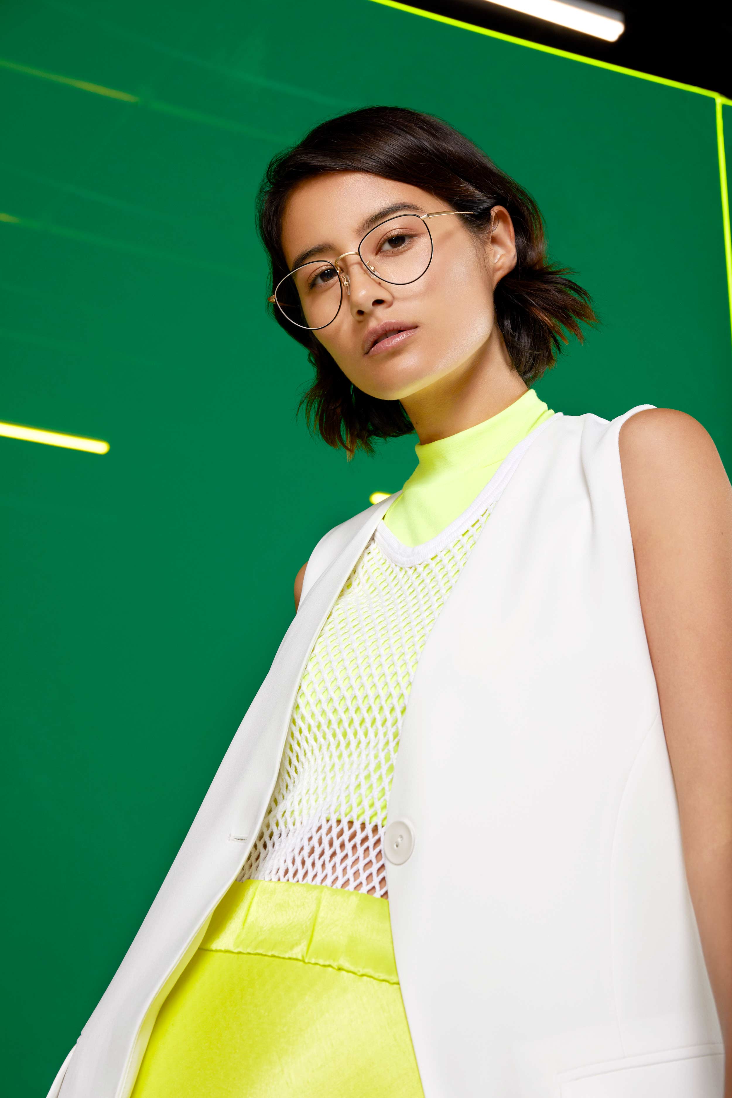
I found from our team that we wanted to explore color trends, to complement the minimal look of the new eyewear collection. I started my research narrowing down the top trends from runway shows with online platforms such as Hypebeast and Vogue. Based on the season and target audiences, we went with Neon Streetwear.

The northstar of our photoshoot is guided by a single creative concept. The challenge was to resonate with all of our global audiences. Based on prior research findings, I developed three concepts to propose to the teams for feedback and buy-in. I also kept in mind the inspiration behind the new eyewear collections to weave within the visual story.
We decided to move forward with the “Colored Acrylic” concept, as it proved to be the most visually striking looking back at our competitor analysis, and would resonate with our audiences from the trend forecasting.

I chose to focus on the set design because it sets the mood and stage for the imagery and other elements will take form after. I explored further the “Colored Acrylic” concept and thought through ideas for the set design experience, including materials, lighting, and props.

After more explorations, I came across an idea from our initial mood board, a free-standing wall of acrylic and thought to place it behind the model photographed. I explored the neon acrylic materials and tried to think about how we could make this “free-standing.” I found this step was most helpful in explaining when I started to collaborate with our Set Designer later.

After I started to create a mockup with the actual material of the acrylic neon sheets we would use on a larger scale, as well as mockups of the actual models.
This helped visualize the set and communicate to our set designer about our intent and also the photographer about angles, without actually being there onsite.

Using our Market Research of the target audiences, I did a talent search from model agencies as well as influencer models. I gathered my insights and proposed them with the team for buy-in.
We settled upon the top candidates who fit the target audience criteria the best as well as budget and timeline, and moved forward following negotiations and onboarding.

From the competitor analysis, we took the opportunities from there and integrated them into the photo direction. We focused on photo usage, angle, poses and depth of field. I worked closely with our photographer to align, which helped tremendously during on-set.


Photo examples of types of angles preferred

In eyewear vertical, depth of field is an important element to highlight the glasses - guidelines here

Examples of type of poses based on competitor analysis previously
Based on the trend forecasting, we explored the concept of the wardrobe as monotone to match or complement the neon background from the set design. We also considered our competitor analysis, finding the opportunity of “the wardrobe styling could be more on-trend and relatable to the target audience.”
I worked closely with our Wardrobe Stylist to communicate this concept. We scheduled a Fitting a day before the shoot, so we could test out all the options of clothing and glasses pairings with the models.


For final deliverables of images used across platforms, click Deliverables tab:
The visual assets helped increase conversion on the US Ecommerce website. The images were used on the homepage hero section for 4 weeks and increased conversion by 2% on average.
Having a visual strategy helps not only the efficiency of creating content, but also aligns all teams in communicating a clear message visually. Most importantly, this trickles down to what the customers sees and interacts with to ultimately help them make an easier purchase decision.
Areas I hoped to gather further insights were in the Discovery phase, especially with the Market Research - digging deeper into each individual country’s target audience might have led to more developed creative concepts. During the trend forecasting, I would’ve liked to do user testing to find which trends resonated most with our target audiences, this could’ve led to stronger relatable content.
Overall, I think this project helped our teams communicate more effectively versus as silos within the organization. I’m excited to apply my skills from creative production into opportunities with user experience design in the future.


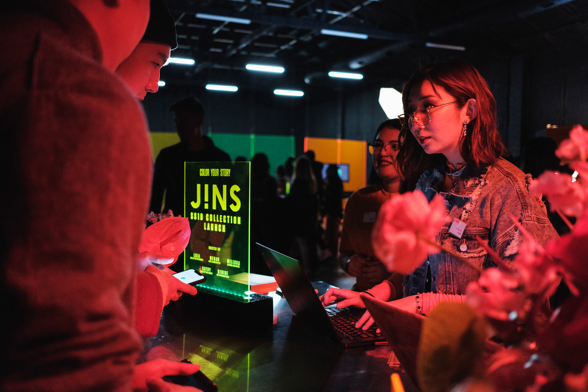


To maximize budget, we also integrated a live launch event using the same set and studio for the event location. I planned the project from conception to launch, as well as managed the event onsite collaborating with event coordinators. Event resulted in 200+ attendees, 15% increase in Instagram growth, and 87% increase in engagement rate.

